
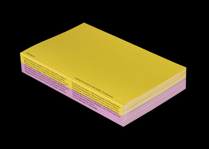
Cover (© Simon Knebel, Bela Meiers, Friederike Spielmannleitern)

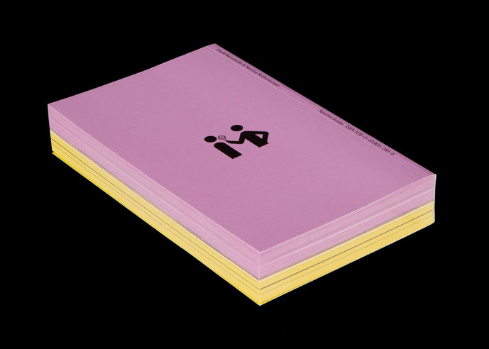
Backcover (© Simon Knebel, Bela Meiers, Friederike Spielmannleitern)

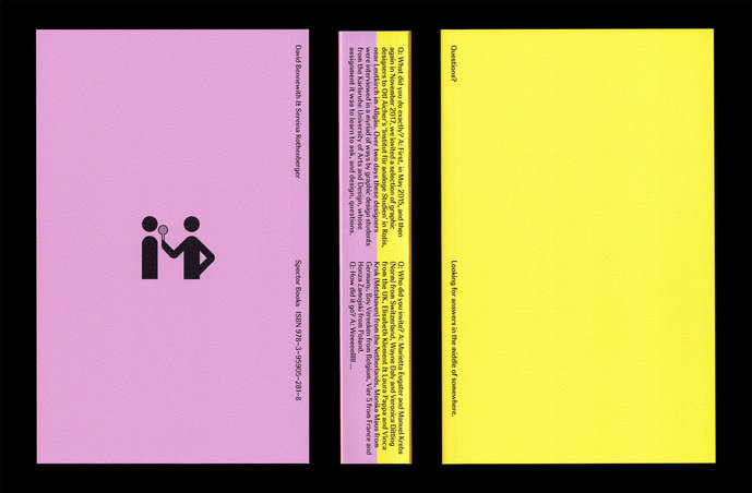
Overview (© Simon Knebel, Bela Meiers, Friederike Spielmannleitern)

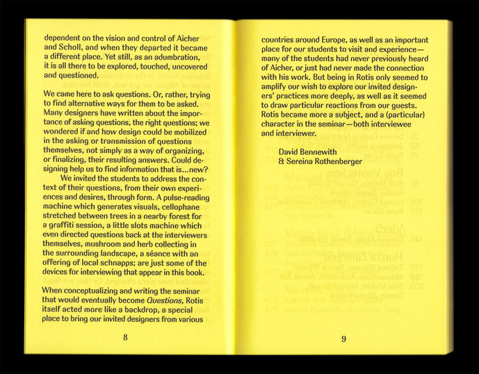
Foreword (© Simon Knebel, Bela Meiers, Friederike Spielmannleitern)

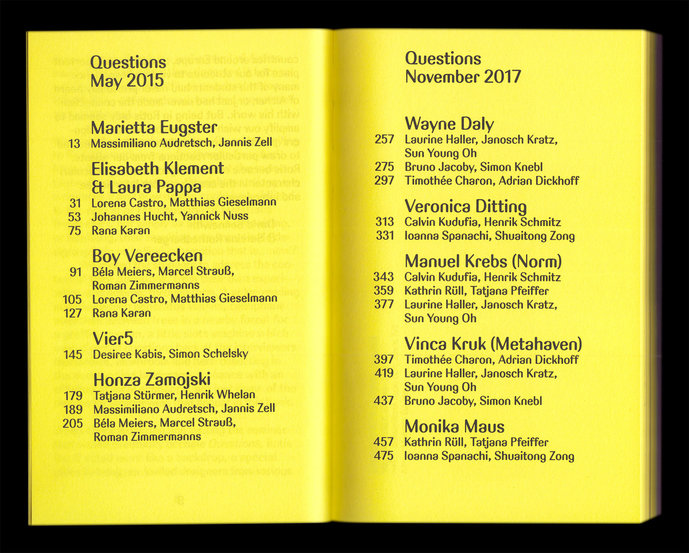
Contents (© Simon Knebel, Bela Meiers, Friederike Spielmannleitern)

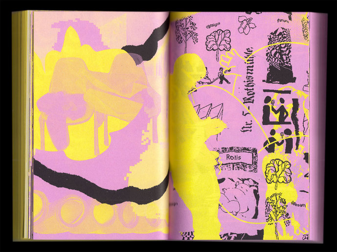
Intermission (© Simon Knebel, Bela Meiers, Friederike Spielmannleitern)

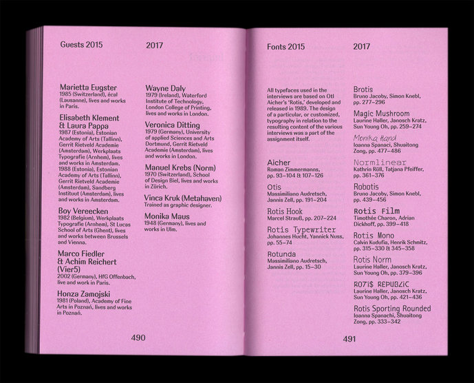
Imprint (© Simon Knebel, Bela Meiers, Friederike Spielmannleitern)

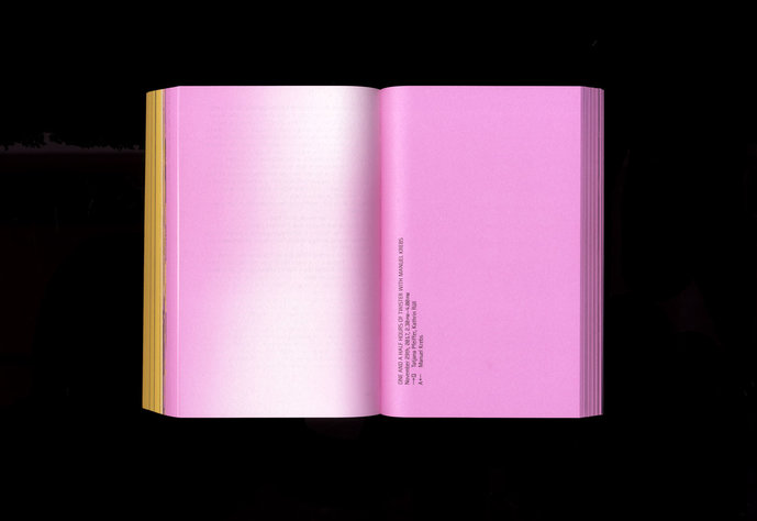
Interview, Layout and Font by Tatjana Pfeiffer und Kathrin Rüll (© Kathrin Rüll)

Interview, Layout and Font by Tatjana Pfeiffer und Kathrin Rüll (© Kathrin Rüll)

Interview, Layout and Font by Tatjana Pfeiffer und Kathrin Rüll (© Kathrin Rüll)

Interview, Layout and Font by Tatjana Pfeiffer und Kathrin Rüll (© Kathrin Rüll)

Interview, Layout and Font by Tatjana Pfeiffer und Kathrin Rüll (© Kathrin Rüll)

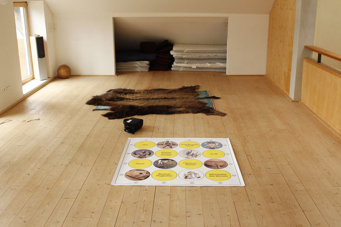
Interview, Layout and Font by Tatjana Pfeiffer und Kathrin Rüll (© Kathrin Rüll)

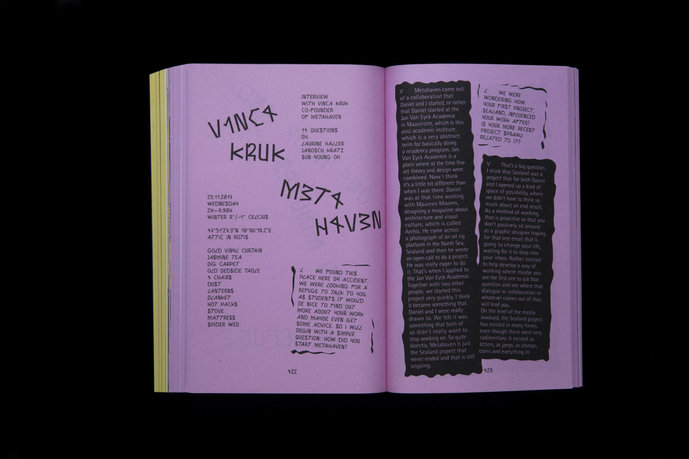
Interview, Layout and Font by Laurine Haller, Janosch Kratz and Sun Young Oh (© Laurine Haller, Janosch Kratz, Sun Young Oh)

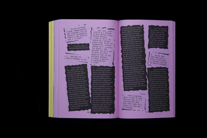
Interview, Layout and Font by Laurine Haller, Janosch Kratz and Sun Young Oh (© Laurine Haller, Janosch Kratz, Sun Young Oh)
In this book, questions are posed as well as designed.
When Prof. Sereina Rothenberger and Prof. David Bennewith invited graphic designers to visit lectures at the University of Design Karlsruhe, they noticed that the students were hesitant to ask questions. They were convinced this was not due to a lack of interest, but rather that the students mainly thought they might ask the “wrong” questions. Rothenberger and Bennewith then decided to hold a seminar which would specifically be about asking questions – a valuable skill also for graphic designers. In May 2015, they invited Marietta Eugster, Elisabeth Klement and Laura Pappa, Vier5 and Honza Zamojski to the “Institute for Analog Studies” by Otl Aicher in Rotis (Germany). In November 2017, they repeated the seminar and invited Wayne Daly, Veronica Ditting, Manuel Krebs (Norm), Vinca Kruk (Metahaven) and Monika Maus.
Over two days, the invited designers were interviewed in a variety of ways by the students, whose task was to understand, ask and design questions. Each interview in this book was designed by a group of students who developed and conducted the interview. Part of the task was to design a font for each interview based on Otl Aicher's “Rotis” (1989). “Rotis” is a universal font that somehow got stuck in time. The redesigns of the students developed in the seminar were all the more remarkable. All the results together are a wild mix of different aesthetic approaches, influenced by the students' perspectives on the works and the interviewees.
A team of three students - Friederike Spielmannleitner, Simon Knebl and Béla Meiers - summarized the interviews and designed the book using their font “Aach” based on typographic sketches of the 1972 Summer Olympics, which they had found in the former Aicher studio complex. The varied content of the interviews is conspicuously divided into two sections, one for each visit to Rotis. The colors of the book represent the different seasons. Winter purple and spring yellow are also a tribute to the colors the team found in Aicher's work. Both sections are supplemented by a chapter of illustrative collages, lending an atmospheric insight into the trip to Rotis. Due to its clear structure and a design that forms perceptible parentheses, the book looks more “marshmallow sweets” than “stone monolith” and itself becomes an object.
The work, produced by students of all age groups, is perhaps the most contemporary insight into the arena of graphic design, as it reflects the current curiosities of the students. It is interesting to question how much of a noticeable difference arose between the designs from 2015 and 2017.
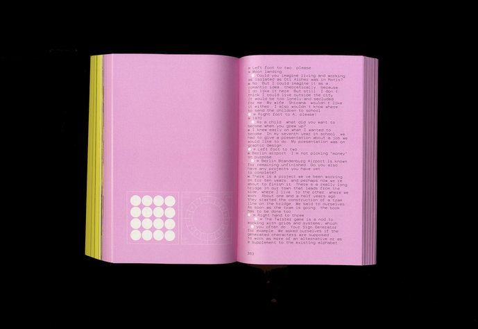
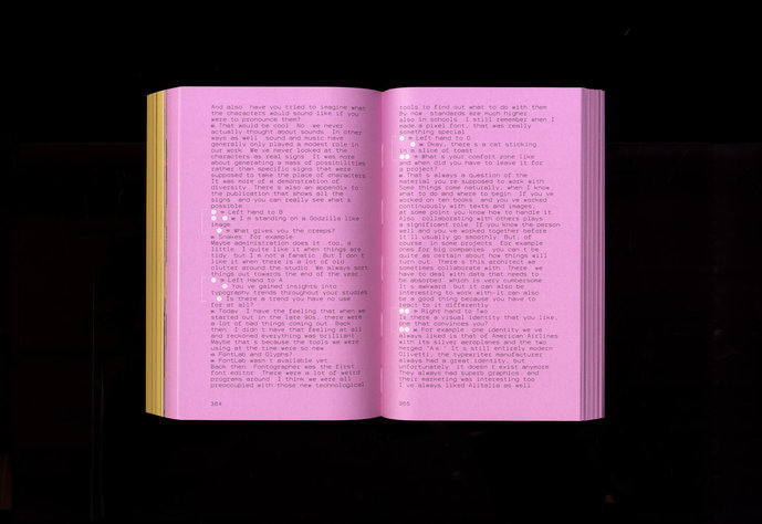
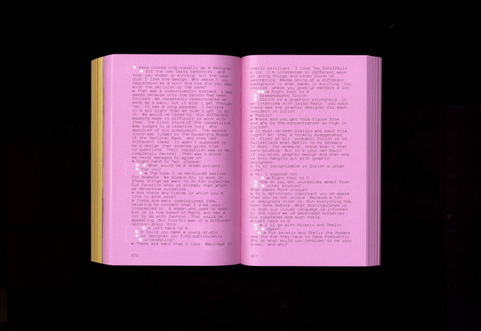
Tatjana Pfeiffer and Kathrin Rüll developed a questionnaire and created an interview setting for Manuel Krebs.
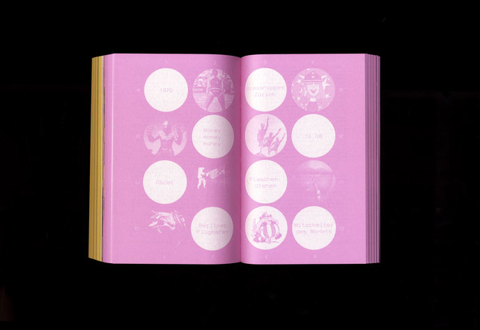
Together with Dimitri Bruni and Ludovic Varone, Krebs forms the Swiss studio NORM, known for their strict work on grids with clear design principles. An example of their work is the Sign Generator. Letters are generated on a chosen grid by combining signs, resulting in approximately 5,000 characters. This principle was applied to the interview both in terms of content and design. A specially designed “Twister” game was used as the grid, containing associative images and terms based on NORM’s work. While the game wheel was being turned, Manuel Krebs had to move in the respective fields and answer the hidden questions. He himself thus created shapes in the grid. At the same time, the game allowed for a relaxed and playful atmosphere, luring the strict and systematic designer out of his comfort zone.
In addition to the transcription of the interviews and the layout design based on the aesthetic of the game “Twister,” the font “Normlinear” was produced. “Normlinear” takes Otl Aicher’s font “Rotis” as a model, takes its basic structure and translates it into a mono-linear, mono-spaced typeface reflecting NORM’s technical sophistication.
The idea for the interview was based on the fact that the students did not know Vinca Kruk and that she would travel there alone.
The students decided to plan a cozy retreat where a good conversation could be had. By chance they found a suitable room in Rotis - with bare concrete floors, chaotic and dusty, and stacked everywhere were old, antiquarian objects; hardly a sunbeam found their way in. In the darkness and seclusion of the room, however, it felt safe and hidden.
In order to create a cozy atmosphere in which a relaxed get-together could take place, blankets were spread out on the floor and tea was served.
In the interview, the students focused on simple topics that were of particular interest to them as students, such as, “How was Metahaven actually founded?” or questions about her book Uncorporate Identity and her experience in teaching.
The students designed their own typeface using the secret typeface concept – cozy and concealed like their interview setting but also secret. The typeface was inspired by the internet font “Leetspeak” in which individual letters were replaced by similar looking numbers or special characters. The new font is called “Rotis Republik.”
When designing the layout, the students again focused on the setting of their interview. The dark background, the irregular text frames and the cut up, slanted text fields are reminiscent of the messy, dusty space. The questions and answers of the interview can be distinguished by the black and white background color of the text fields and the font used (“Rotis” and “Rotis Republic”).
Authors:
Massimiliano Audretsch, Lorena Castro, Timothée Charon, Adrian Dickhoff, Matthias Gieselmann, Laurine Haller, Johannes Hucht, Bruno Jacoby, Desiree Kabis, Rana Karan, Simon Knebl, Janosch Kratz, Calvin Kudufia, Béla Meiers, Yannick Nuss, Sun Young Oh, Tatjana Pfeiffer, Kathrin Rüll, Simon Schelsky, Henrik Schmitz, Ioanna Spanachi, Tatjana Stürmer, Marcel Strauß, Henriette Wehking, Hendrik Whelan, Jannis Zell, Roman Zimmermanns, Shuaitong Zong
Editors:
David Bennewith & Sereina Rothenberger für die Staatliche Hochschule für Gestaltung Karlsruhe
Design:
Béla Meiers, Simon Knebl, Friederike Spielmannleitner
Publisher:
Spector Books
ISBN: 9783959052818
Tutors: Sereina Rothenberger, David Bennewith